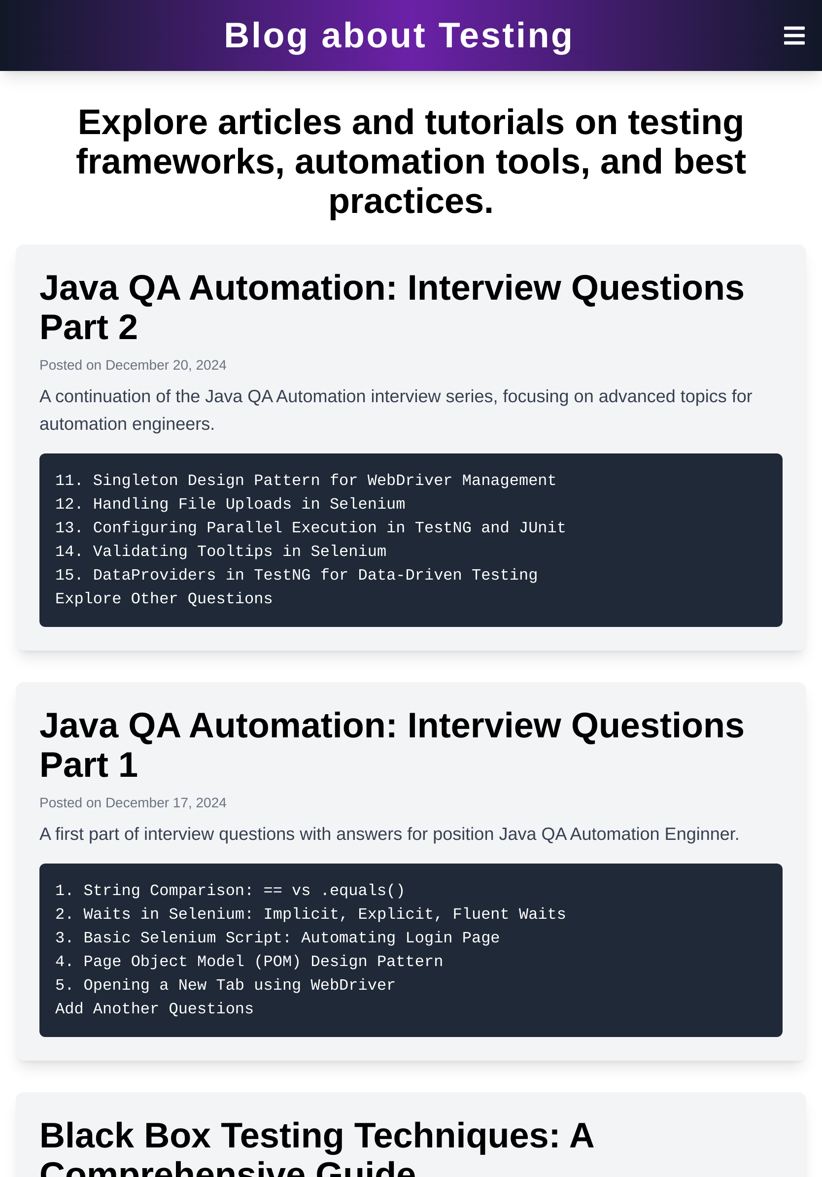
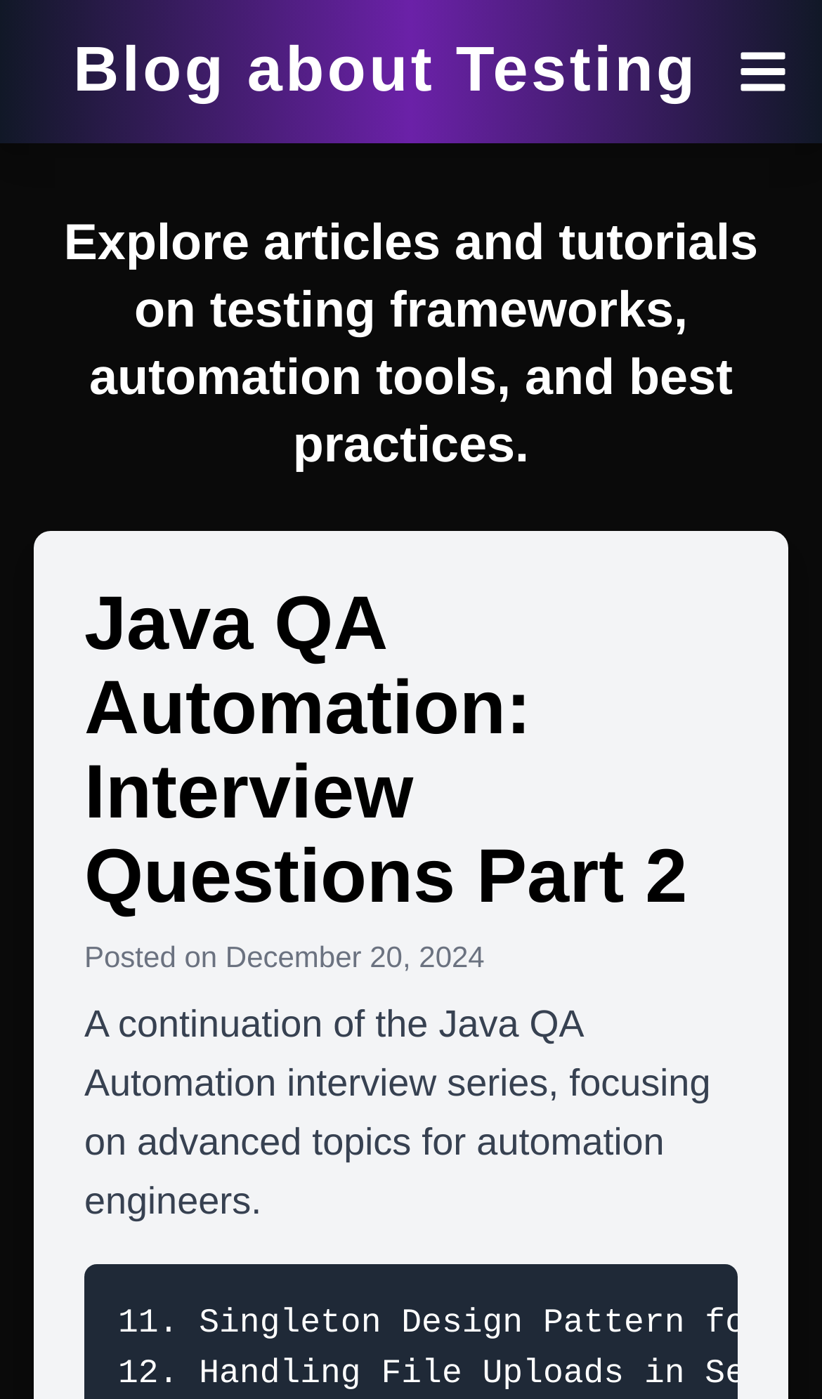
Visual Regression Testing for Small & Medium Screens in light and dark modes with Playwright
In this guide, we will focus on performing visual regression testing for small and medium-sized screens (such as mobile and tablet devices) in both light and dark modes using Playwright. Responsive design is crucial to ensure that your UI components render correctly across different devices.
If you haven't read the first post on setting up Playwright tests, make sure to check it out for an introduction to Playwright testing:Setting Up Playwright for TestingAdditionally, if you're looking for more details on visual regression testing, feel free to explore our post here:Visual Regression Testing with Playwright. This post builds upon those and focuses specifically on visual regression testing for small and medium screens.
Why Visual Regression Testing for Small & Medium Screens?
Visual regression testing is particularly important for smaller screens as it helps identify layout issues, overflowing elements, or broken designs that may not appear on larger screens. This ensures that users have a seamless experience regardless of their device.
Option 1: Setting Up Playwright for Device Testing
First, let's set up Playwright to test on various screen sizes. Playwright allows you to simulate mobile and tablet devices in your tests. To get started, we can configure our Playwright test to capture screenshots from small to medium devices.
import { test, expect, devices } from '@playwright/test';

const iPhone = devices['iPhone 12'];
const iPad = devices['iPad Pro 11'];

test('Visual snapshot on small and medium screens', async ({ browser }) => {
    // Simulate iPhone 12
    const iPhoneContext = await browser.newContext({
        ...iPhone,
    });
    const iPhonePage = await iPhoneContext.newPage();
    await iPhonePage.goto('https://sergeipetrukhin.vercel.app');
    const iPhoneScreenshot = await iPhonePage.screenshot();
    expect(iPhoneScreenshot).toMatchSnapshot('iphone12.png');
    await iPhoneContext.close();

    // Simulate iPad Pro 11
    const iPadContext = await browser.newContext({
        ...iPad,
    });
    const iPadPage = await iPadContext.newPage();
    await iPadPage.goto('https://sergeipetrukhin.vercel.app');
    const iPadScreenshot = await iPadPage.screenshot();
    expect(iPadScreenshot).toMatchSnapshot('ipadpro11.png');
    await iPadContext.close();
});
In this code, we first simulate the iPhone 12 and iPad Pro 11 devices. We then capture a screenshot and compare it to a baseline image. The first time the test runs, it will save the screenshot as a reference for future tests.
Option 2: Configuring Different Viewports
To test how your website behaves across small and medium screen sizes, we can configure custom viewports in Playwright. You can also set different sizes to simulate various screen resolutions.
test('Visual snapshot on different screen sizes', async ({ page }) => {
    // Simulate mobile viewport (320x480px)
    await page.setViewportSize({ width: 320, height: 480 });
    await page.goto('https://sergeipetrukhin.vercel.app');
    const screenshot = await page.screenshot();
    expect(screenshot).toMatchSnapshot('mobile.png');

    // Simulate tablet viewport (768x1024px)
    await page.setViewportSize({ width: 768, height: 1024 });
    await page.goto('https://sergeipetrukhin.vercel.app');
    const screenshot = await page.screenshot();
    expect(screenshot).toMatchSnapshot('tablet.png');
});
Configuring Playwright for Dark Mode Testing
To ensure your website or application behaves well in dark mode, you can simulate it in Playwright. Here's how you can configure dark mode for your visual regression tests:
Emulating Dark Mode in Browser Context
You can directly configure Playwright to emulate dark mode on the browser level by modifying the `colorScheme` in the `newContext` method. This method ensures that the browser will behave as if it is in dark mode, allowing you to test how your website reacts to it.
import { test, expect, devices } from '@playwright/test';

const iPhone = devices['iPhone 12'];

test('Visual snapshot with dark mode emulation', async ({ browser }) => {
  // Create a new context with dark mode emulation
  const context = await browser.newContext({
    colorScheme: 'dark',
    ...iPhone, // Simulating iPhone 12 for example
  });

  const page = await context.newPage();
  await page.goto('https://sergeipetrukhin.vercel.app');

  // Capture a screenshot with dark mode enabled
  const screenshot = await page.screenshot();
  expect(screenshot).toMatchSnapshot('dark-mode-iphone12.png');

  await context.close();
});
In this method, we create a new browser context where the `colorScheme` is set to `dark`, and the Playwright browser will emulate dark mode as if the user has it enabled.
The most reliable way to test for dark mode is by using the browser context emulation, which simulates the user's system settings directly. This approach doesn't require any modifications to the website itself, ensuring accurate results without needing to inject classes or use CSS workarounds.
Update playwright libraries and download browsers
In some cases it's needed to update playwright libraries and install browsers for tests execution. To do this:
sudo npx playwright install-depsnpx playwright installRunning Your Tests on Small and Medium Screens
After setting up your tests, it's time to run them. Use Playwright's test runner to execute the tests across different devices and screen sizes.
npm run test src/tests/smallscreens.spec.tsAnalyzing Results for Small and Medium Screens
Once the tests have run, Playwright will generate visual snapshots that you can analyze for any UI discrepancies. If your design isn't rendering correctly, the screenshot comparison will flag the differences.
npx playwright show-reportHandling Minor Differences
For small pixel differences caused by dynamic content or minor layout changes, you can adjust the `maxDiffPixels` option to allow some flexibility in the comparison.
test('Visual test with pixel difference allowance', async ({ page }) => {
    await page.setViewportSize({ width: 320, height: 480 });
    await page.goto('https://sergeipetrukhin.vercel.app');
    const screenshot = await page.screenshot();
    expect(screenshot).toMatchSnapshot('mobile.png', { maxDiffPixels: 100 });
});
Conclusion
Visual regression testing on small and medium screens is an essential part of responsive design testing. By integrating Playwright into your workflow, you can ensure that your website looks great on mobile and tablet devices and identify visual inconsistencies early in the development process.


